About
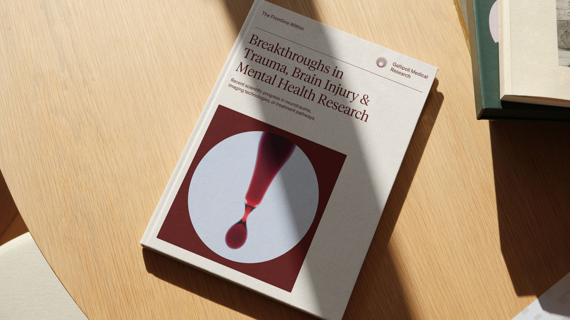
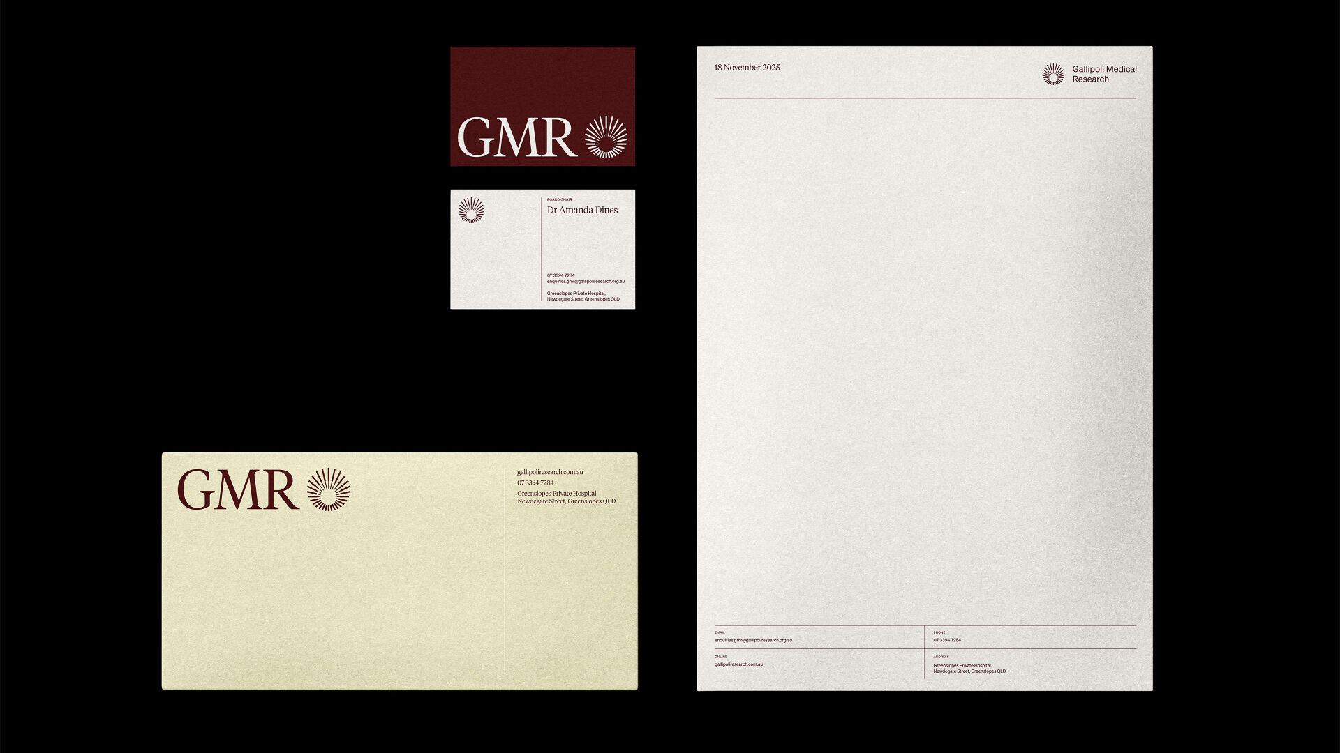
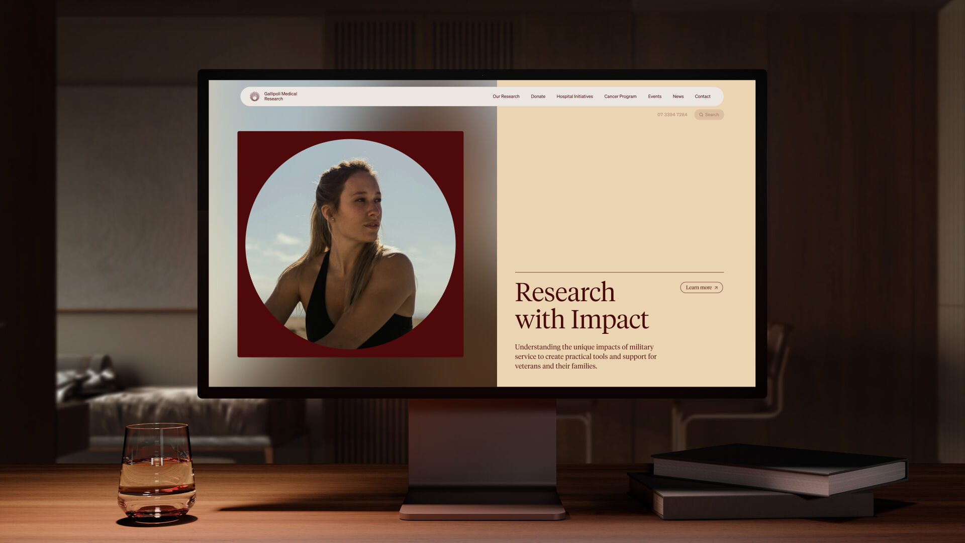
The brand direction for Gallipoli Medical Research aimed to position the organisation as a world-class research institute while still honouring its veteran roots. The identity needed to reflect scientific innovation without alienating the community that shaped it.
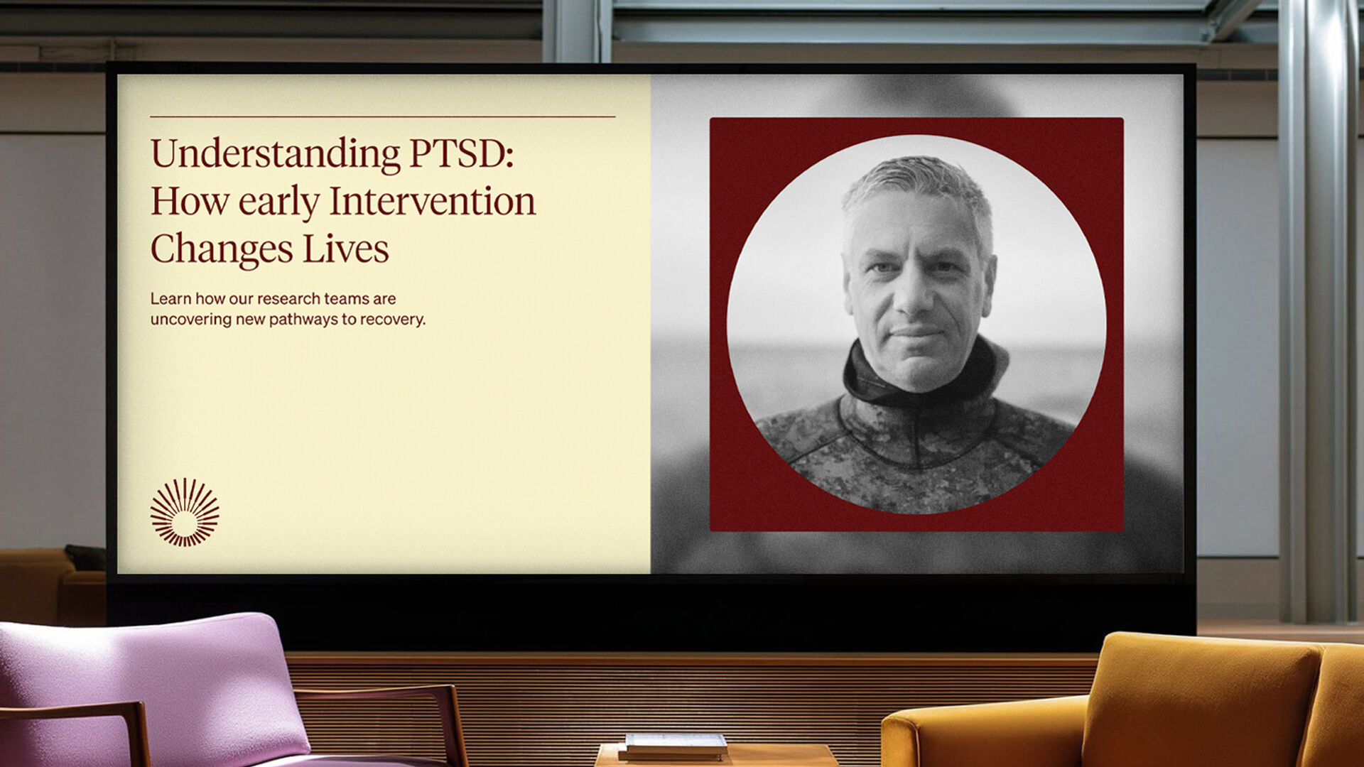
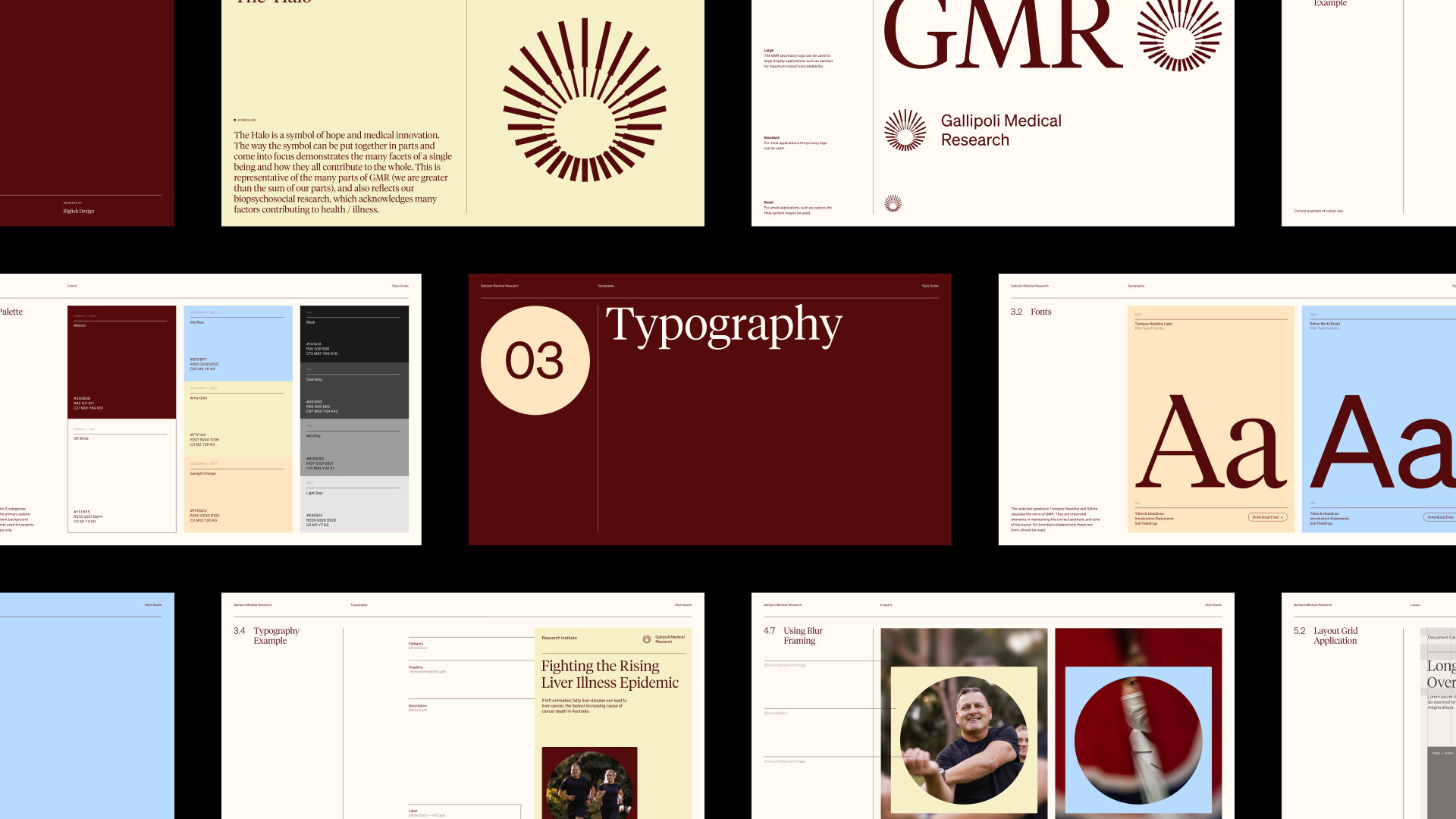
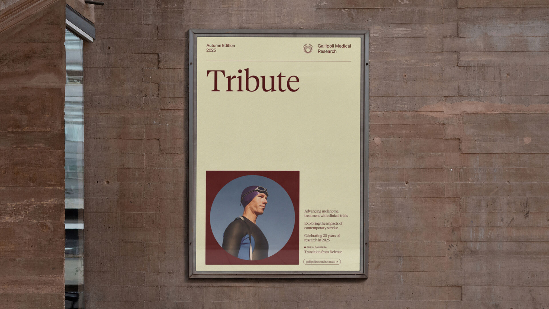
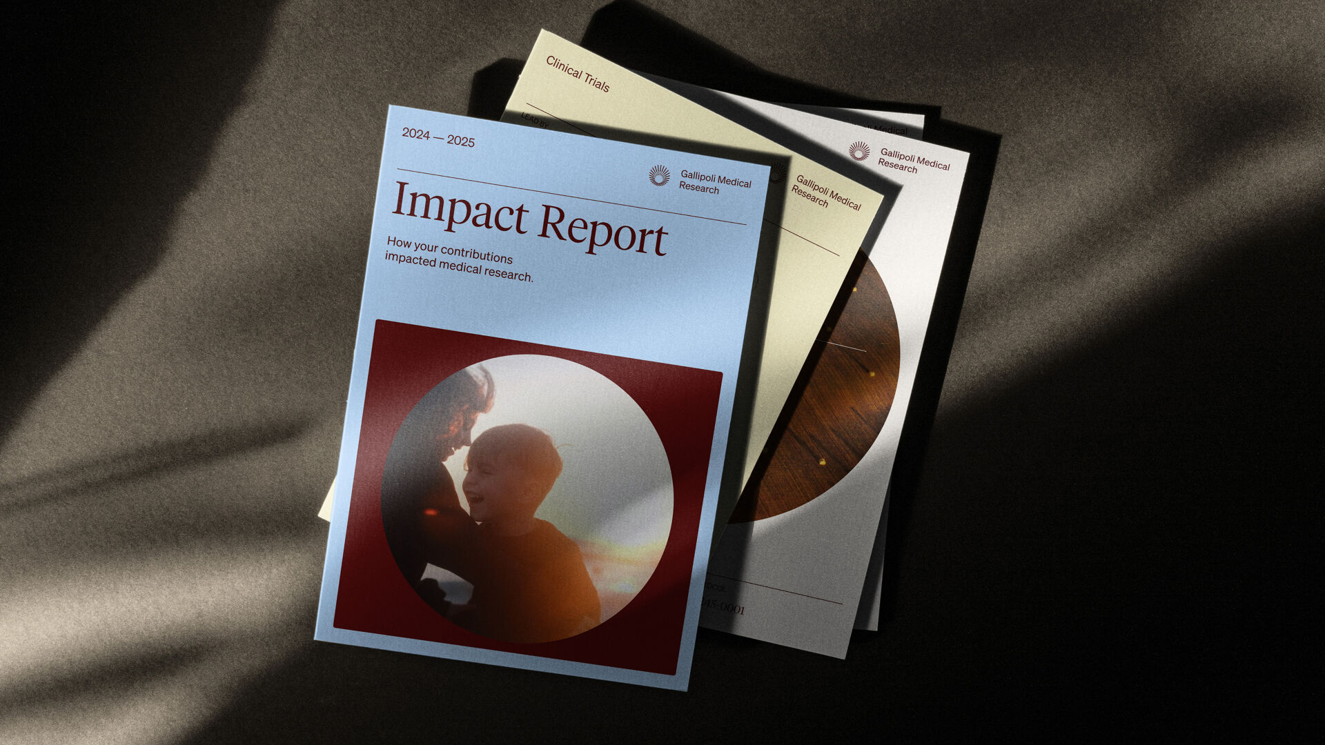
A distinctly Queensland colour palette brings warmth and a strong sense of place, supported by photography that feels both welcoming and professional. This helps the brand resonate with the broader local community as well as the medical research sector.
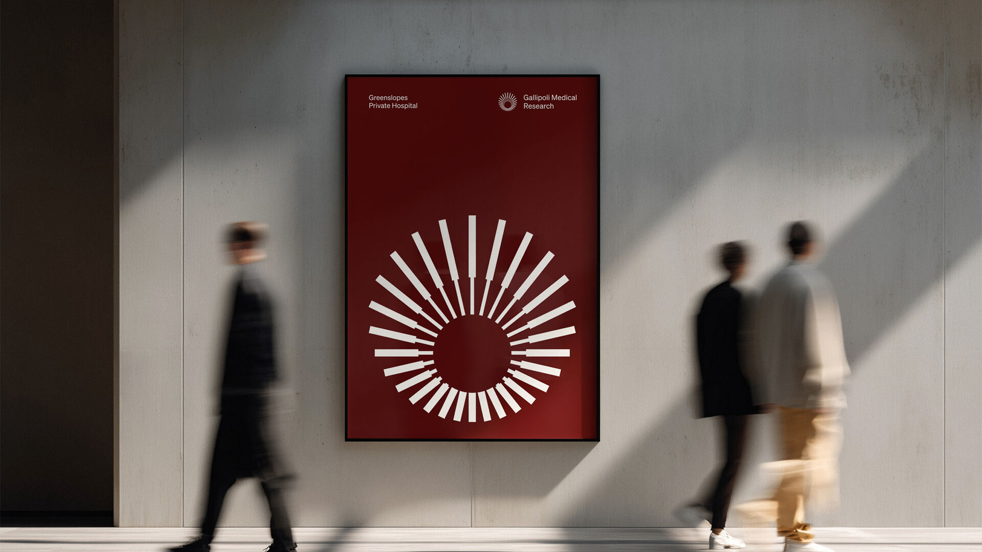
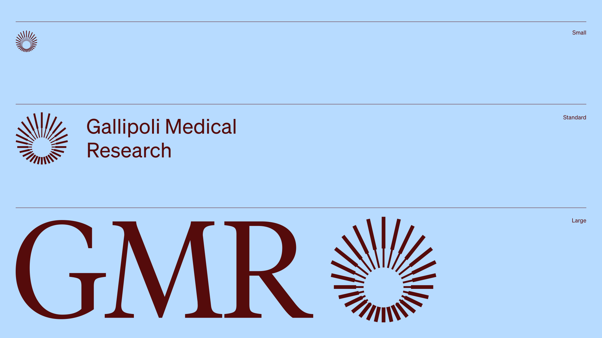
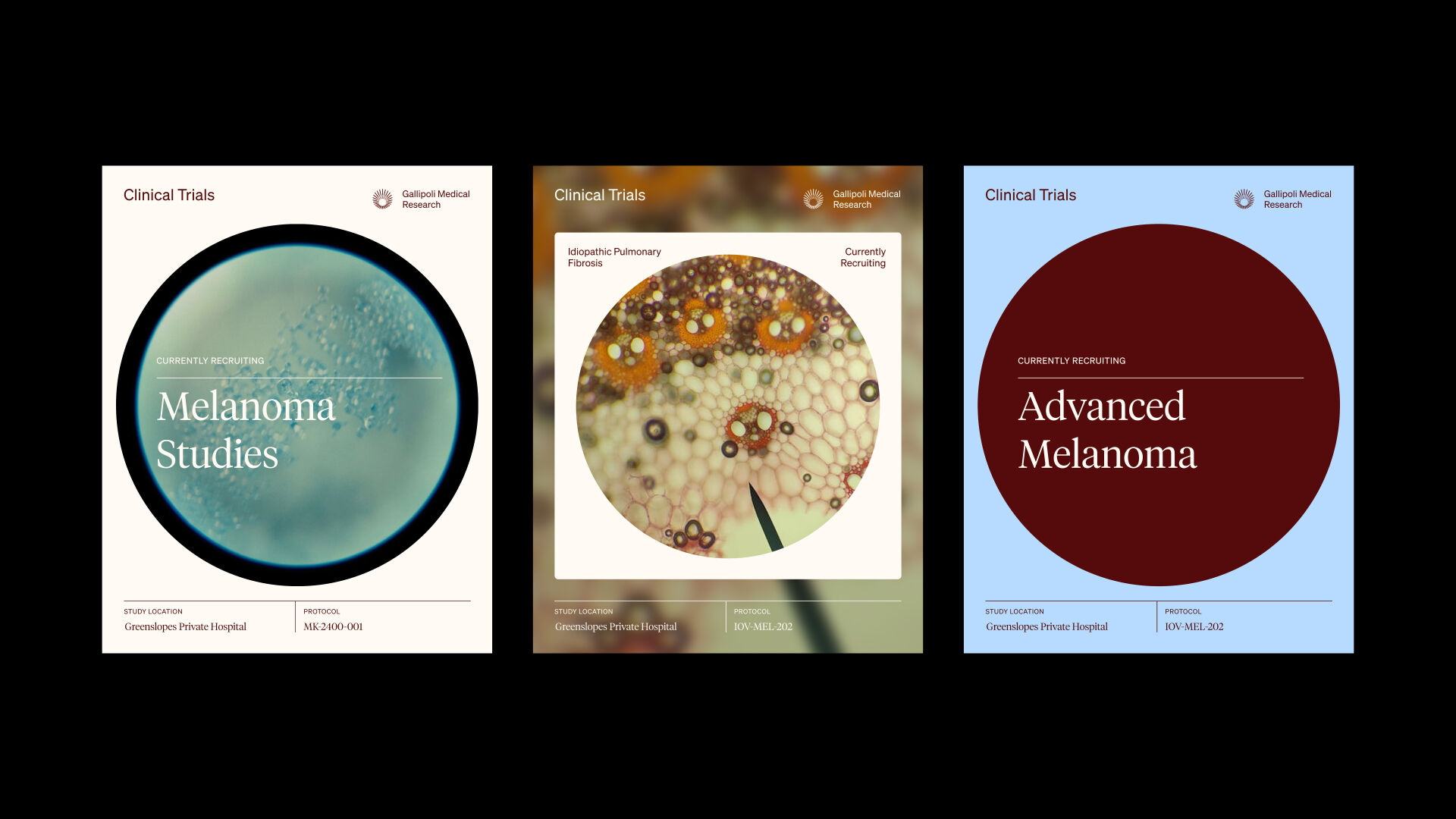
The idea of “bringing things into focus” sits at the heart of the visual language. Circular forms reference a microscope’s view, paired with a halo symbol that evokes the sun, new beginnings, and a feeling of life and comfort. Together, these elements create a brand that is modern, human, and deeply connected to its origins.
Services
- Visual Identity
- Photography
- Motion Graphics
- Brand Strategy
- Graphic Design
The Halo is a symbol of hope and medical innovation. The way the symbol can be put together in parts and come into focus demonstrates the many facets of a single being and how they all contribute to the whole. This is representative of the many parts of GMR (we are greater than the sum of our parts), and also reflects our biopsychosocial research, which acknowledges many factors contributing to health / illness.
