About
The Gold Coast's Home of the Arts
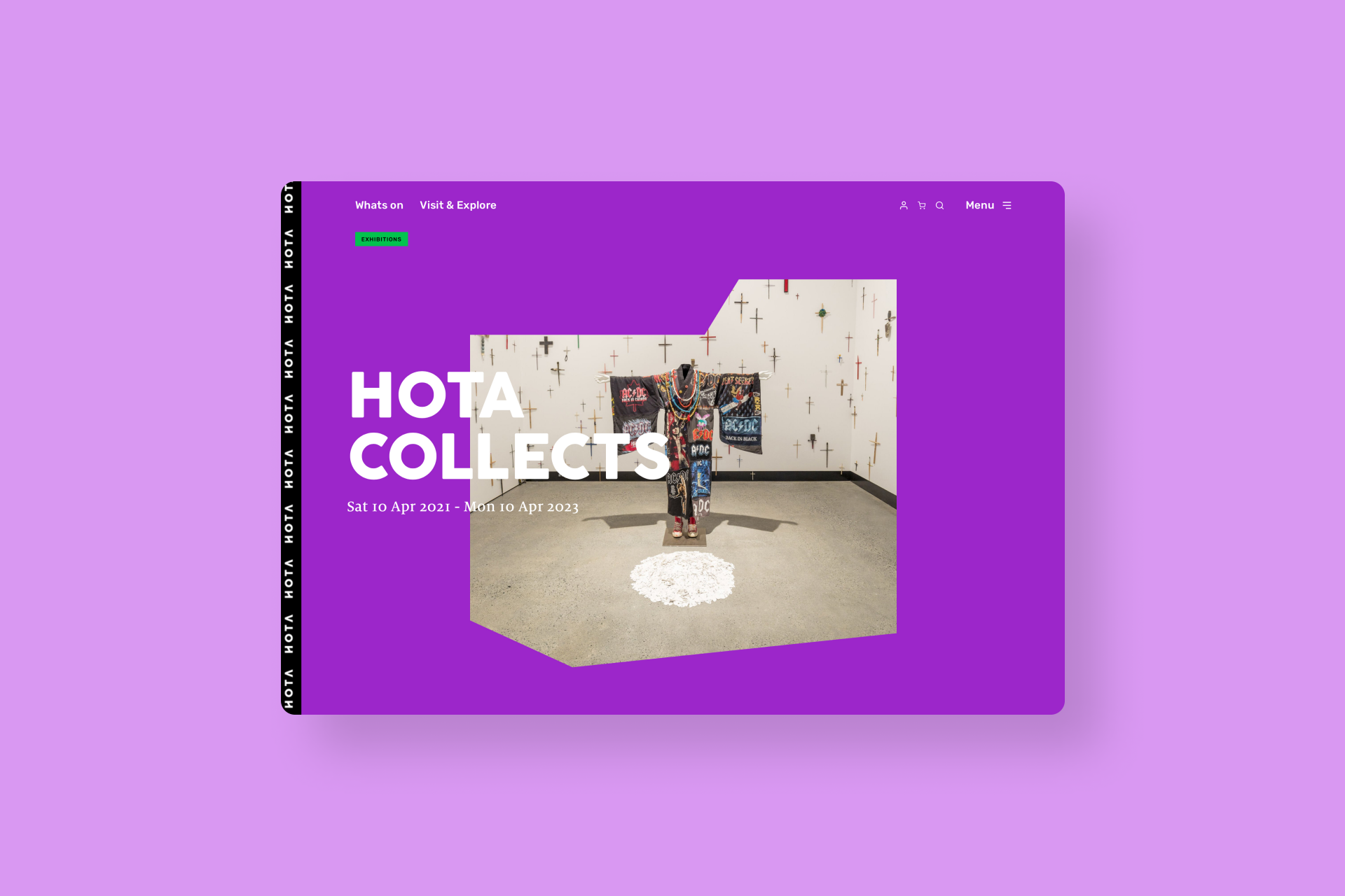
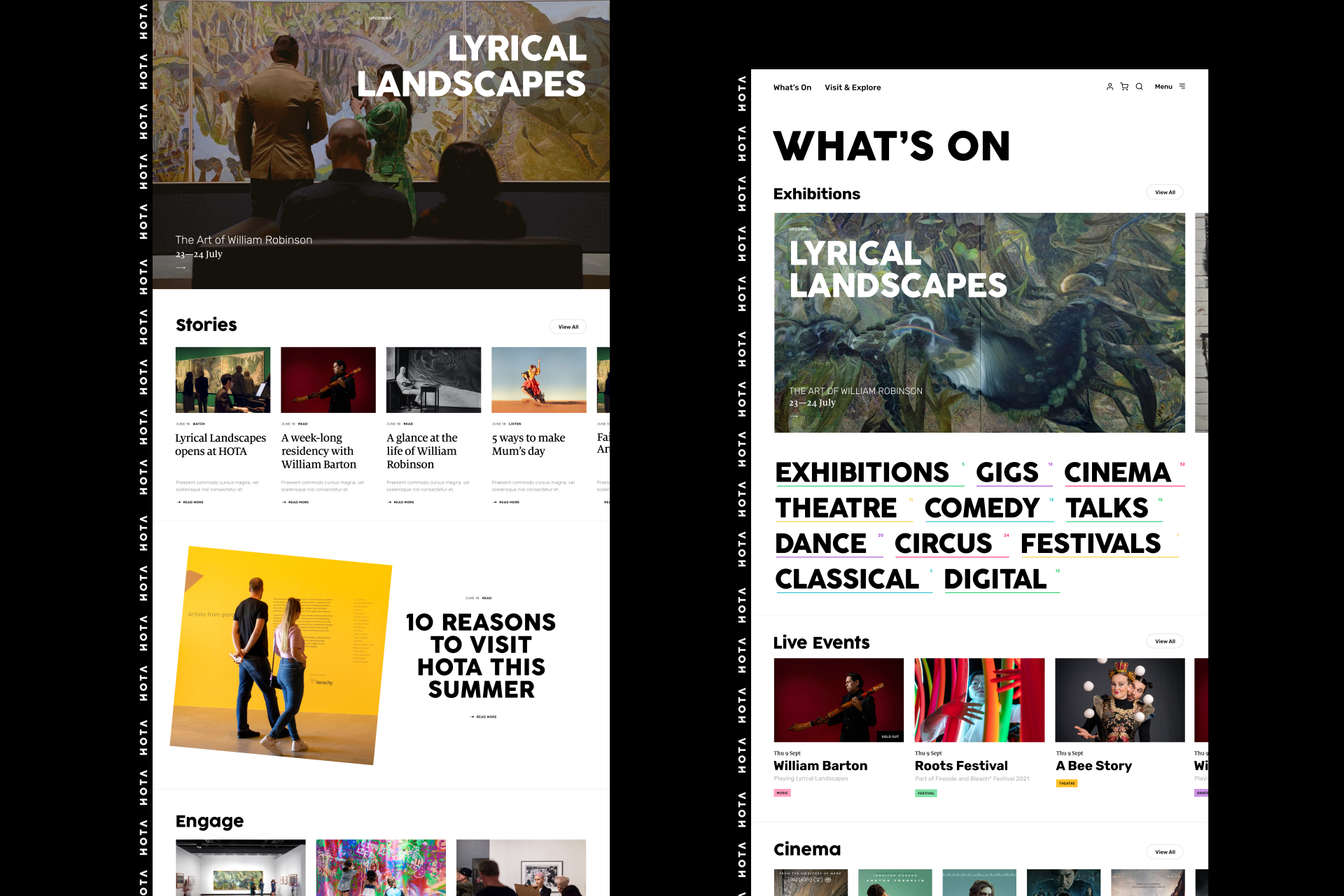
Balancing aesthetics with functionality was the key aim for HOTA. Inspired by HOTA's architecture and public art we created an interface that encouraged exploration and discovery while always providing clear paths to critical content. The design centers around geometry and movement. HOTA's coloured Voronoi shapes provide bright coloured moments of interest and movement throughout the site. Even the HOTA logo is constantly moving, inspired by the LED panels at HOTA's entrance.
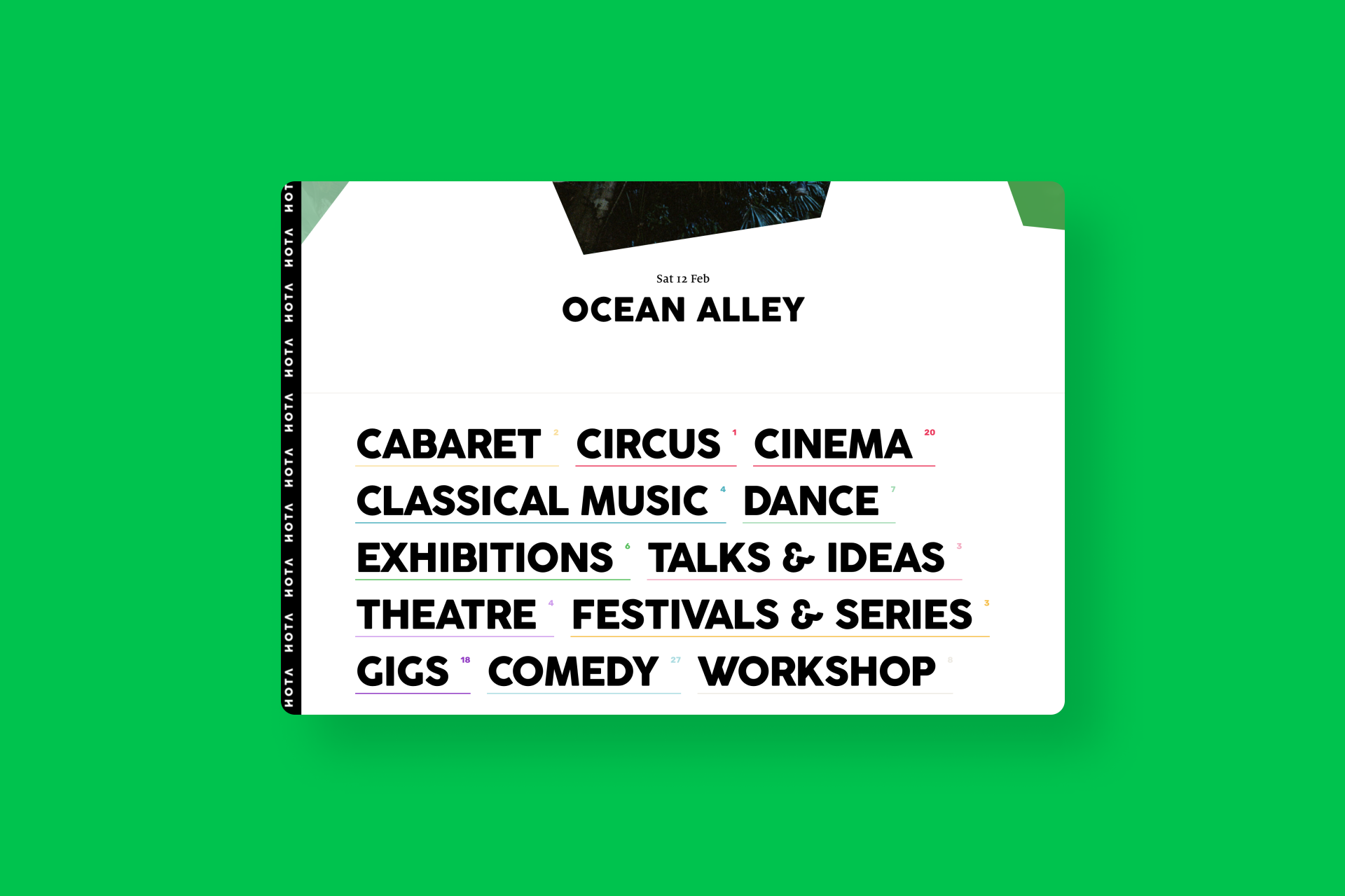
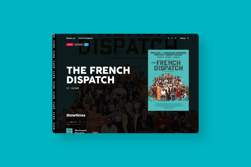
The HOTA website equality excels when it comes to critical functions like searching events, buying tickets, and ease of use on all devices. Each event type (exhibitions, cinema, live events) was treated individually with large hero listings for exhibitions - filtering by genre, audience, and time for live events. We also created a custom-developed cinema showtimes interface for time-based browsing.


