About
Brand & Website
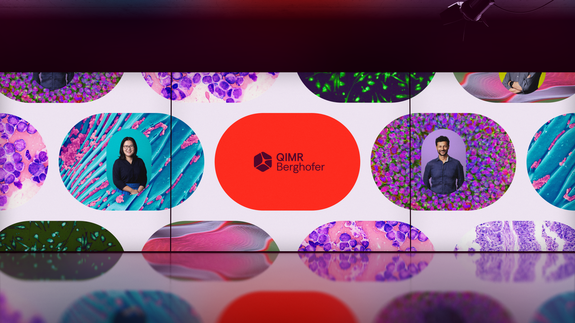
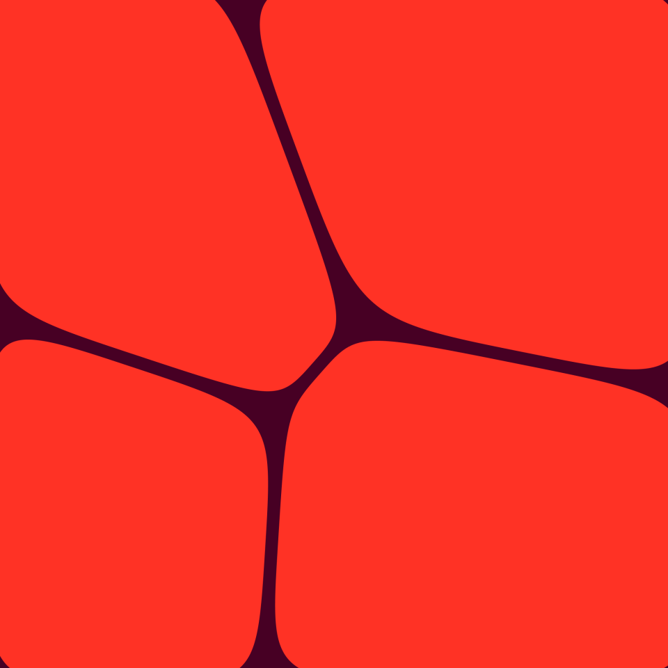
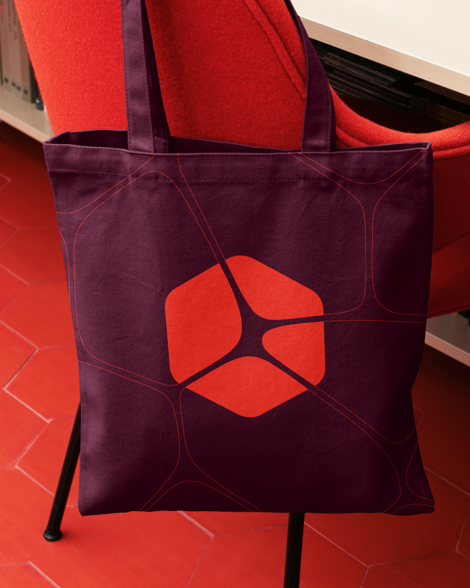
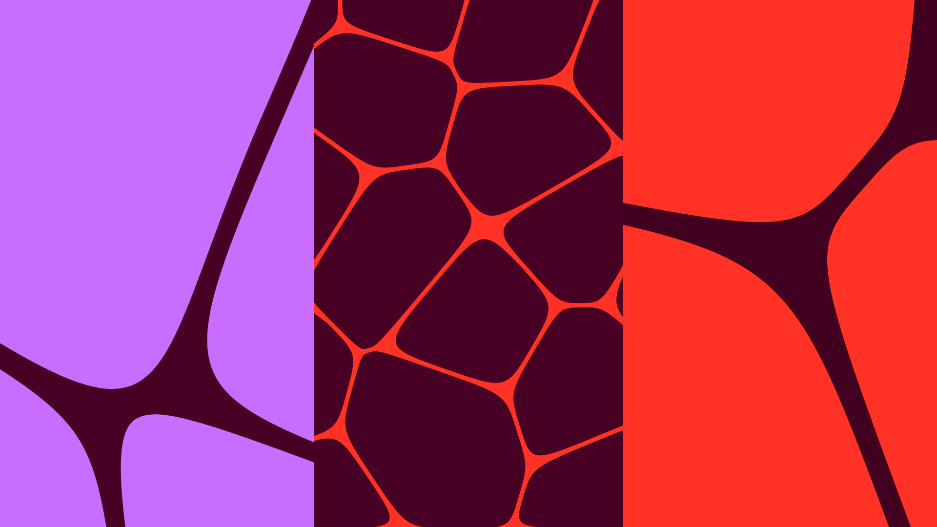
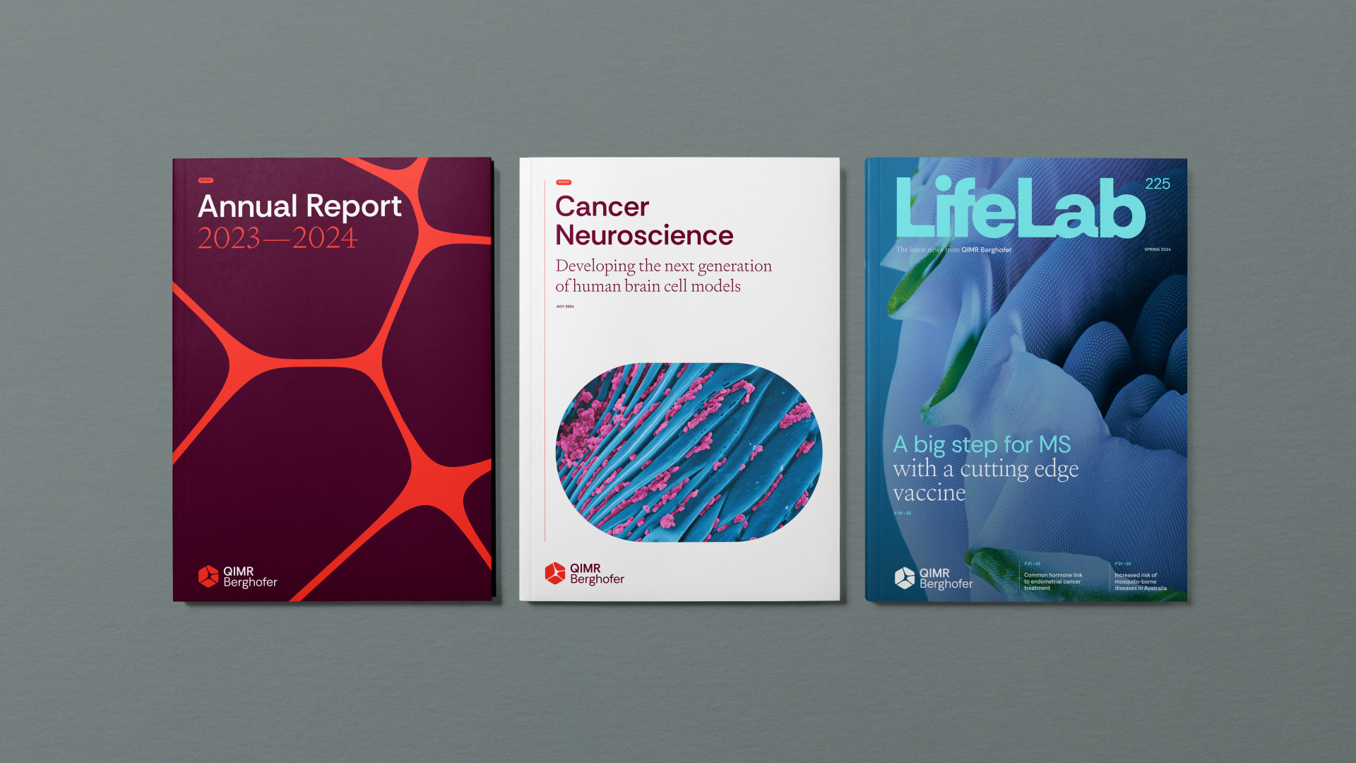
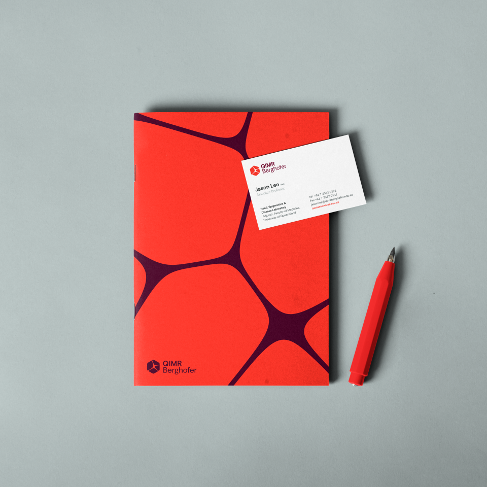
QIMR Berghofer has a strong Queensland legacy of pioneering and visionary research since 1864. The new identity needed to respect this history while fearlessly looking ahead. It also had to unify the organisation by visually representing its four distinct research programs working together under one roof. After exploring many directions, we kept returning to a simple yet powerful idea: 4 areas = 4 cells, 1 institution = 1 hexagon (a key element of their historic identity). Using Voronoi mathematics to create details cell patterns, we created a unique logo that is simple in form but rich in scientific detail.
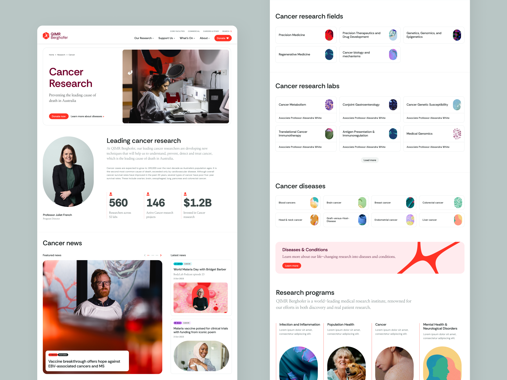
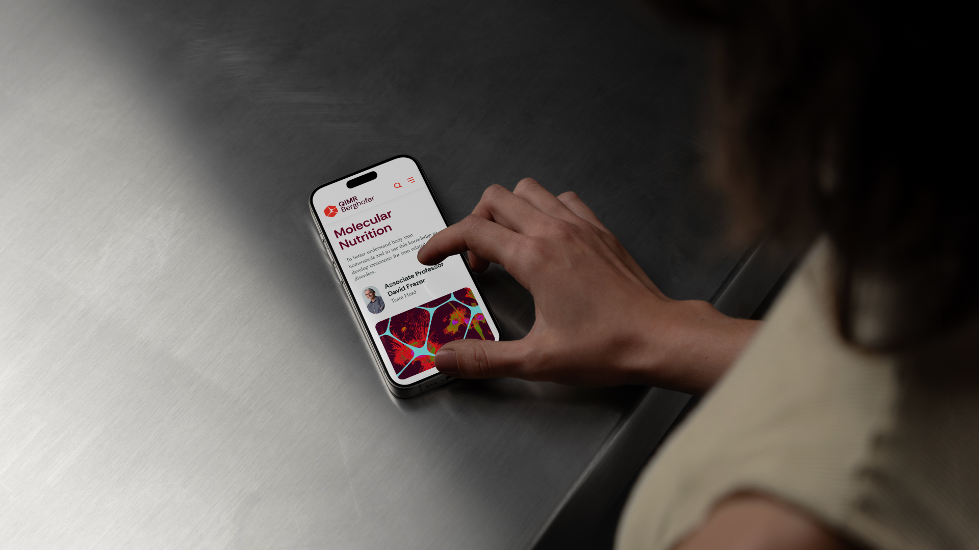
The website posed a different challenge—presenting hundreds of labs and thousands of researchers' work in a way that was engaging for the public and practical for the scientific community. We tackled this by designing a modular UI and interconnected UX inspired by cellular structures. This approach created a seamless, user-friendly interface that made complex research easy to navigate. Built on our powerful Tank CMS, the site ensures that QIMR’s vast research network is both accessible and adaptable for the future.
Services
- Brand Strategy
- Visual Identity
- Website
- Custom CMS
- Video
- Motion Graphics
- Graphic Design
- Photography


Visual Identity
Hexagon symbol exploration

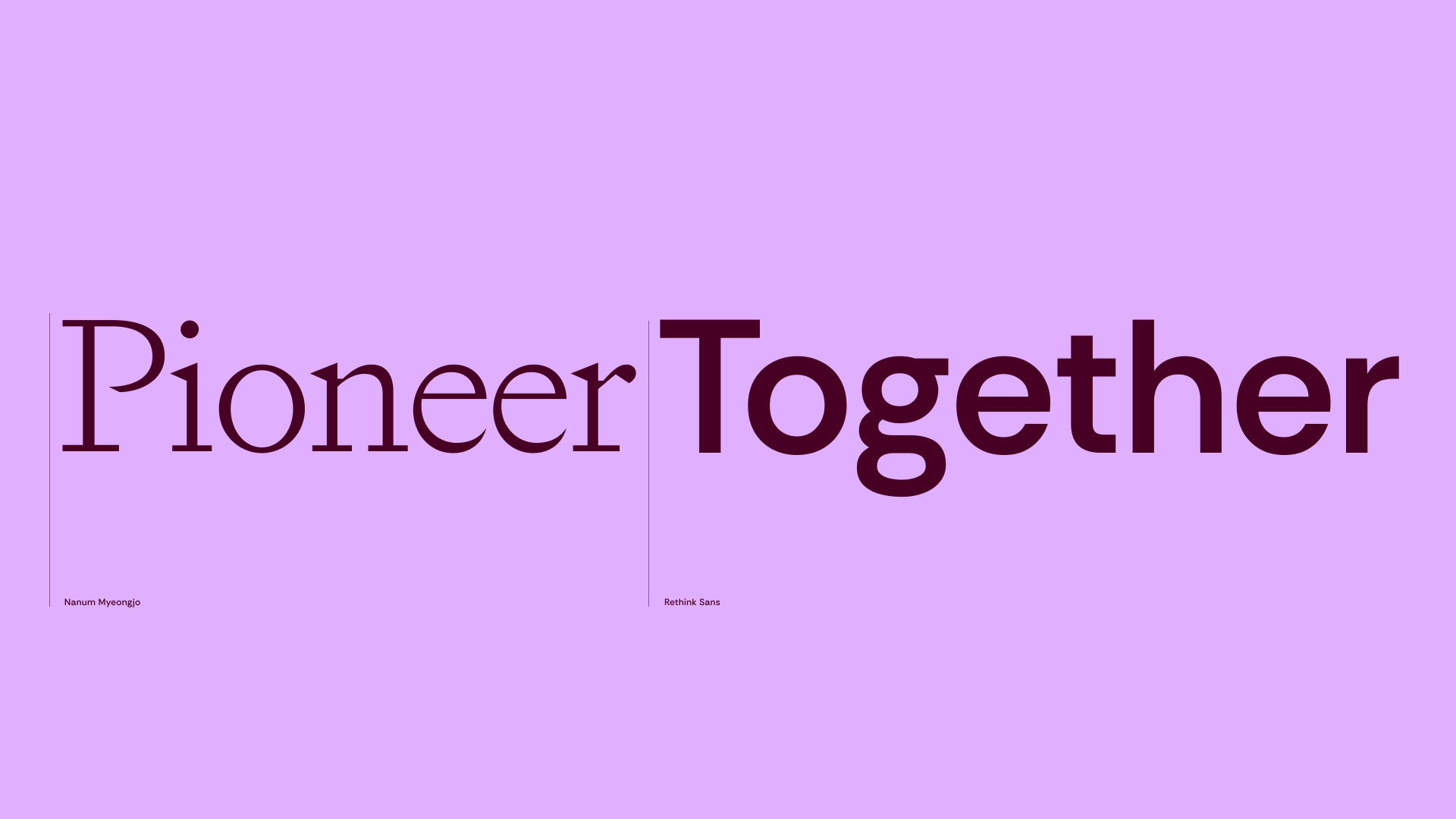
Customised wordmark
Voronoi Cell Generator
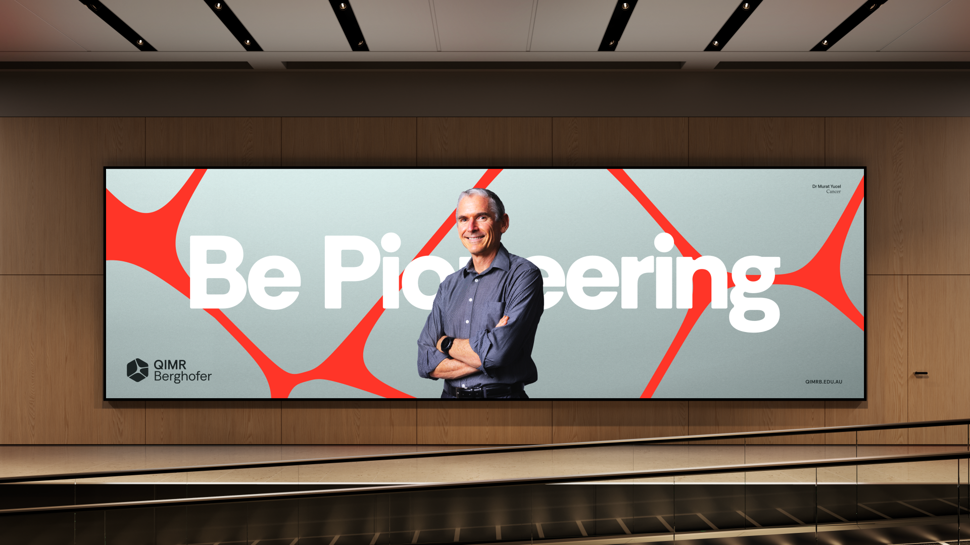
Art Direction and Motion
Website