About
Making the complex simple
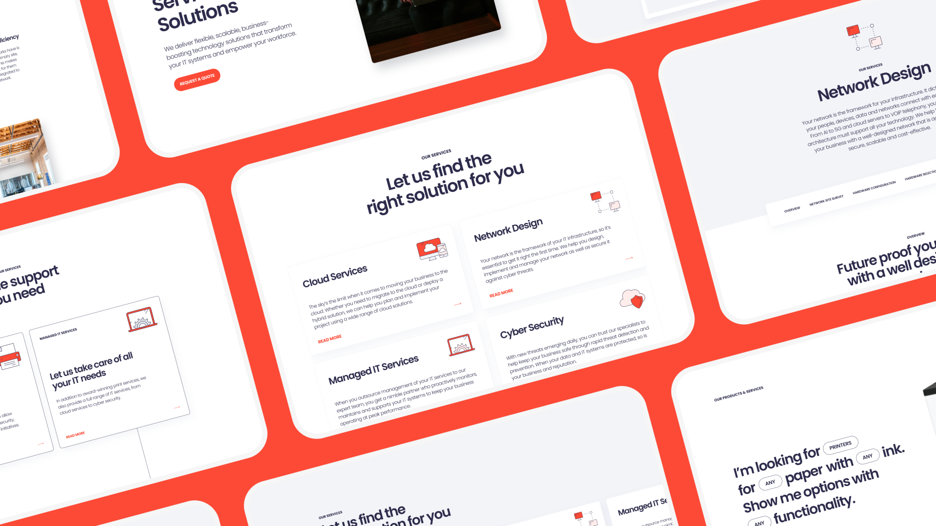
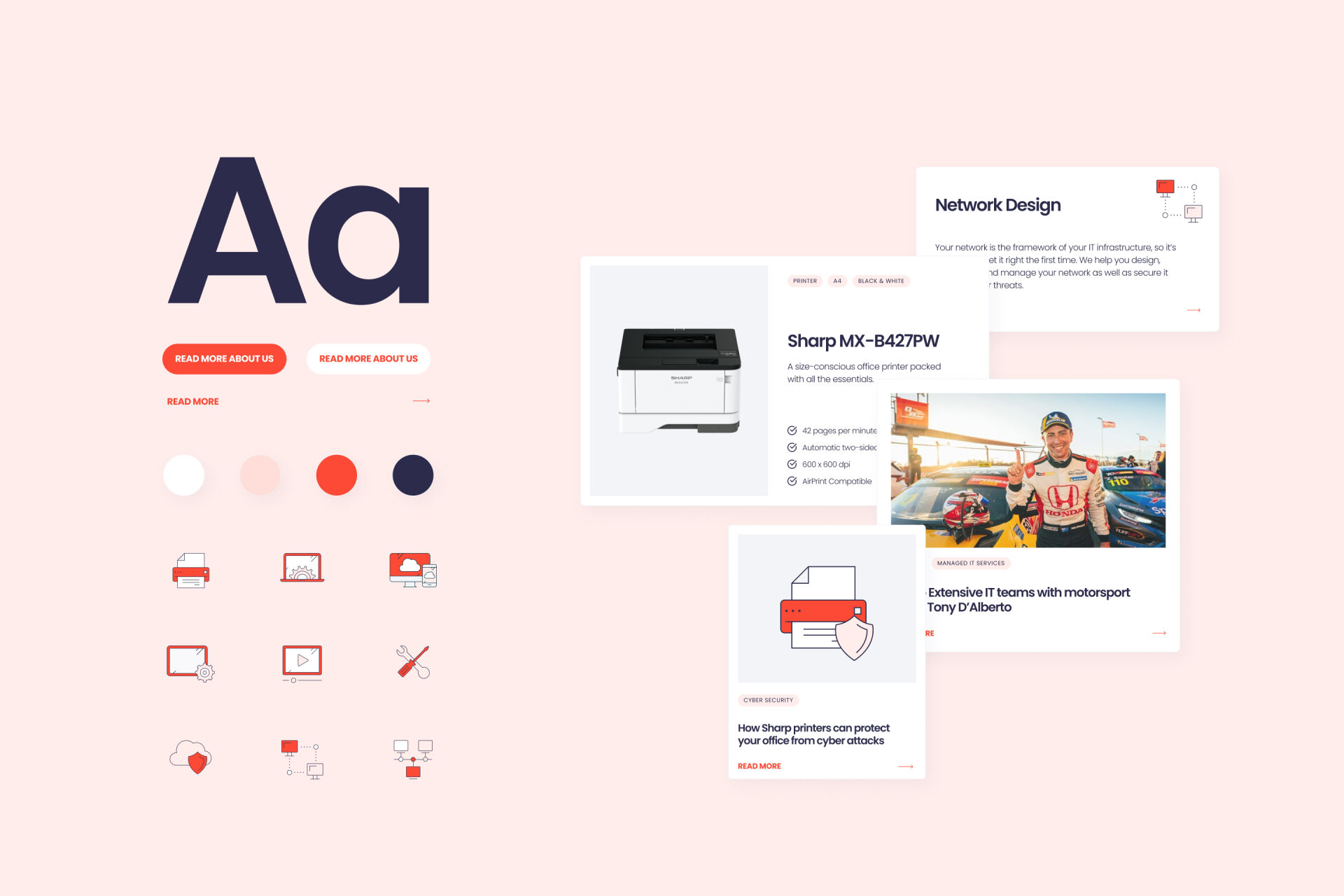
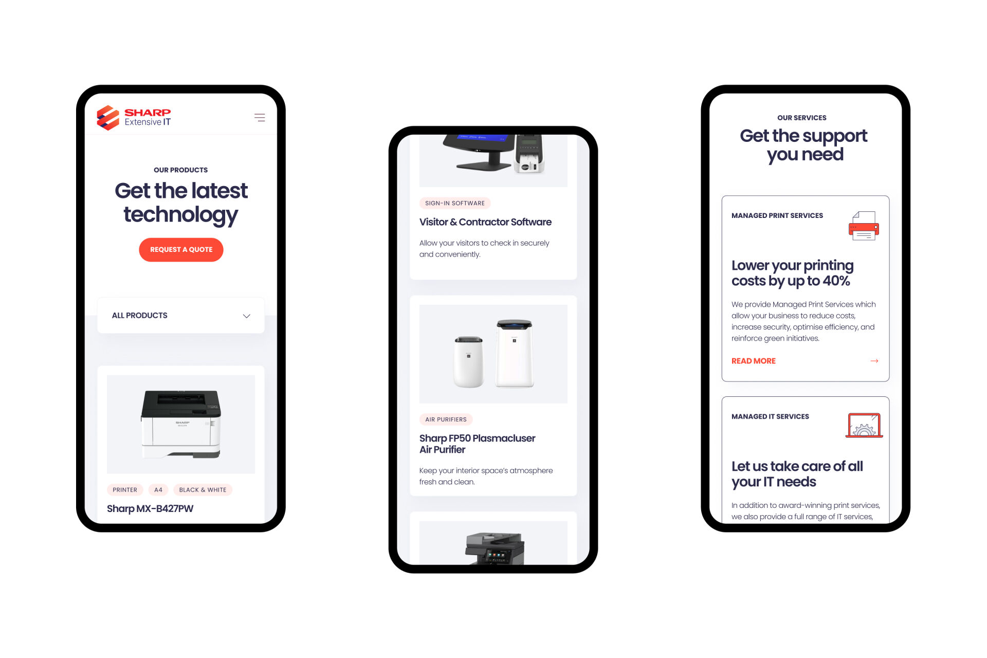
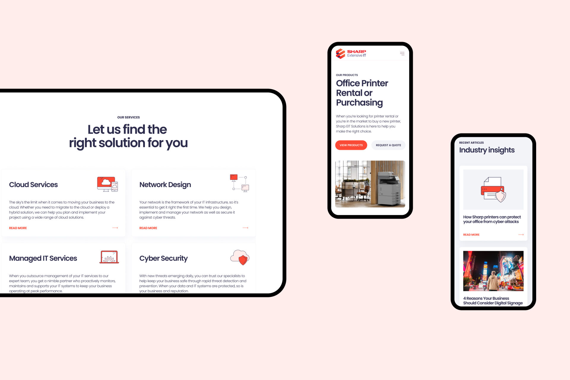
Sharp EIT was originally two separate websites: one for their technology services, and one for their products. To create a cohesive integration with a smooth user experience, we created a clean, minimalist design system with varied content types that flexed for different uses. Like varied card styles, each with their own unique purpose and flavour. We also developed an extensive icon library to add character and visual consistency.
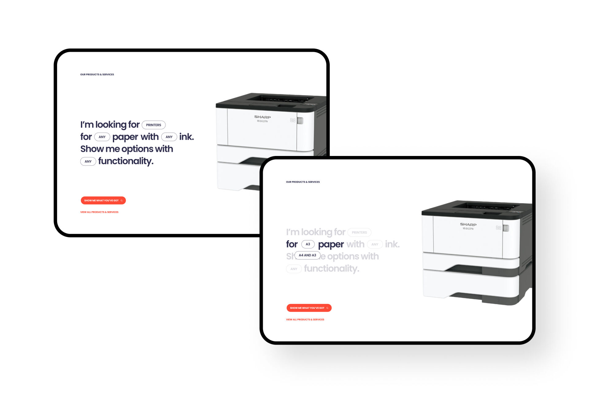
We also built some custom functionality to simplify some of the site's complexities. To help users quickly navigate to the page they're after, we created a phrase-based search component, surfacing information in a more human-way. We also added product variations to declutter their product pages, helping users to see only what's most important. Finally, custom forms and third-party integrations helped them streamline their inbound marketing process, keeping everything in the one place.
