About
A Brand for Brisbane
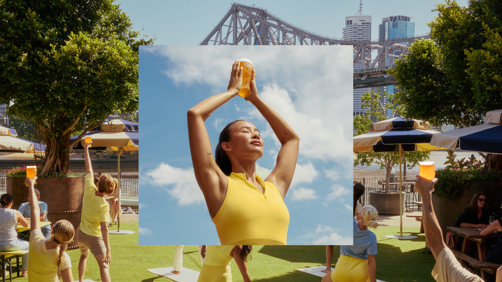
Brisbane is a difficult city to visually represent. It often tries to compare itself to its more well-known southern cities, but Brisbane has neither the iconic landmarks of Sydney nor the cultural cool of Melbourne. But, Brisbane is arguably (and unbiasedly) one of the best cities in the world to live in. There's a new sense of confidence that's emerged in the last few years with people finally embracing their hometown and wanting to celebrate it. The weather, the cafes, the river, the parks, the architecture all at once feel more special than they ever have before.
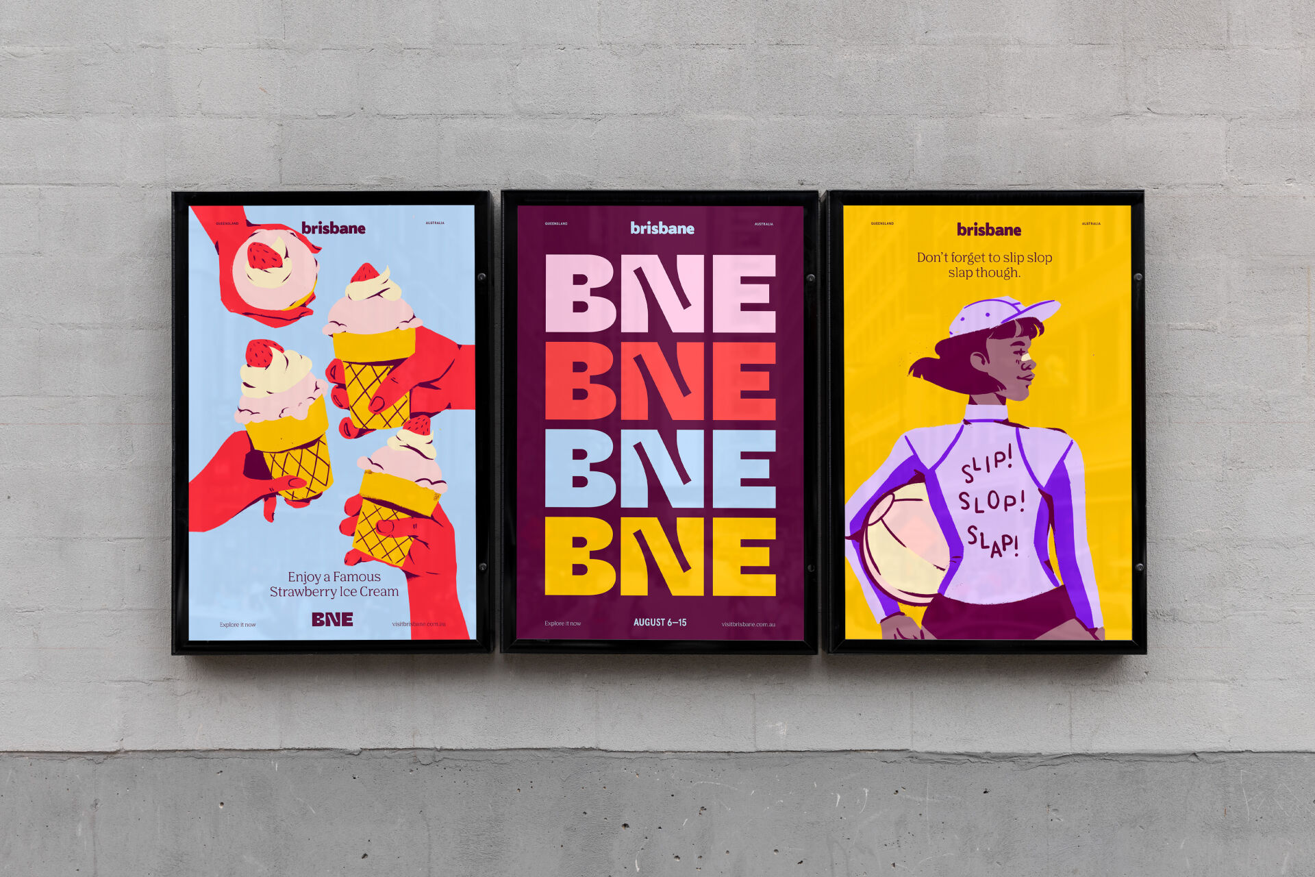
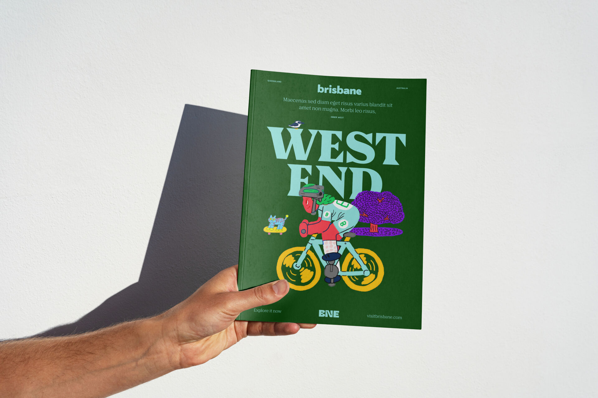
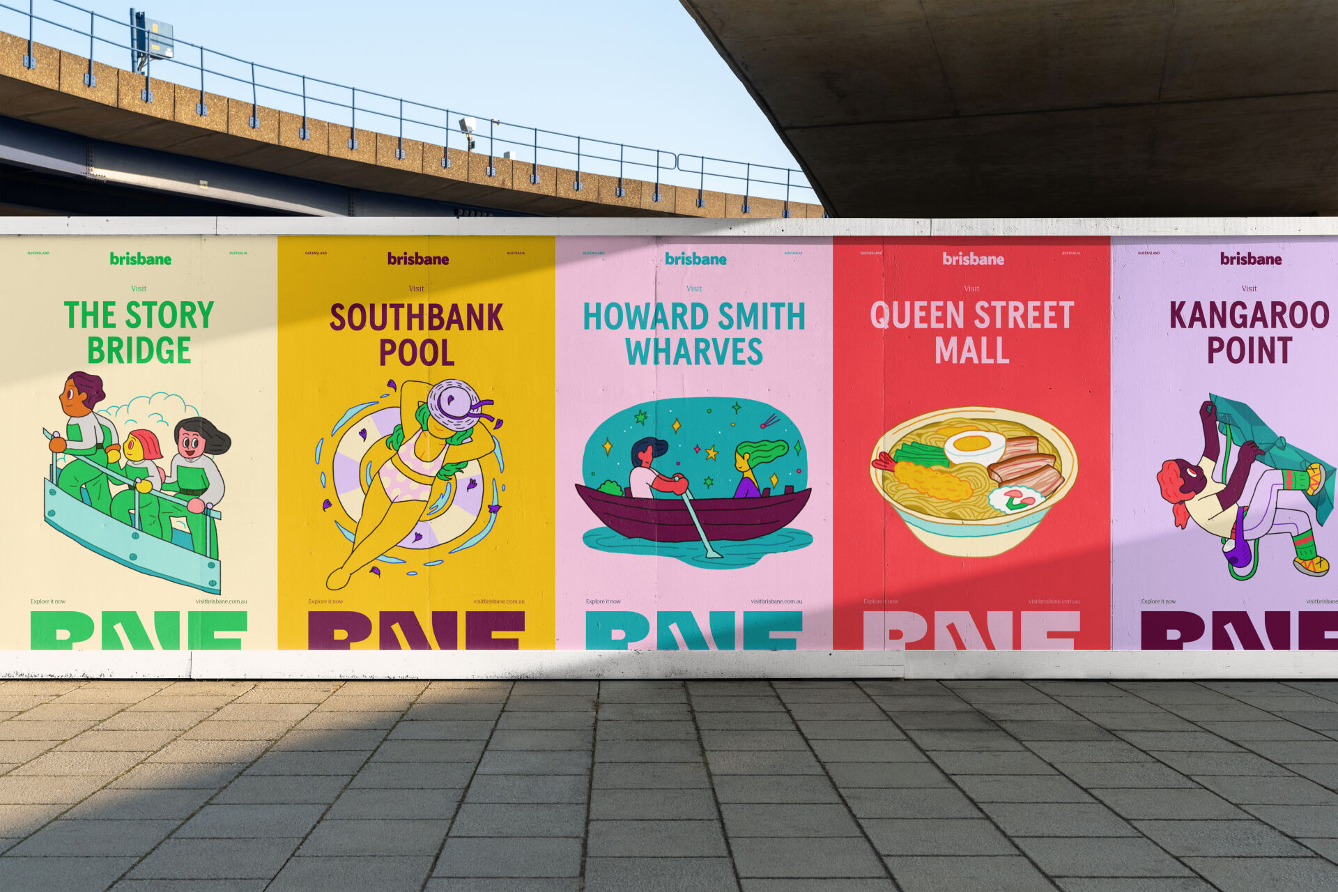
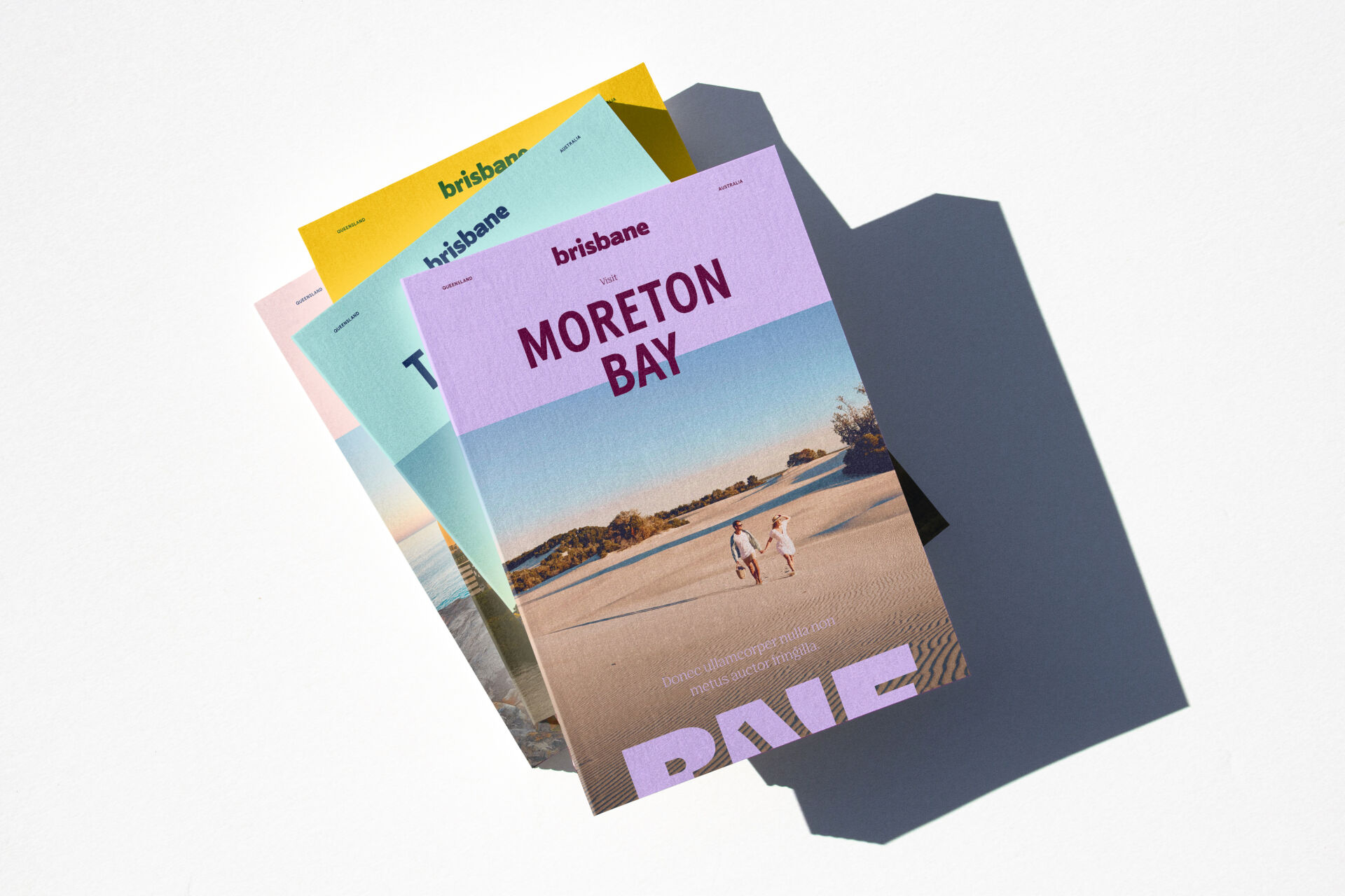
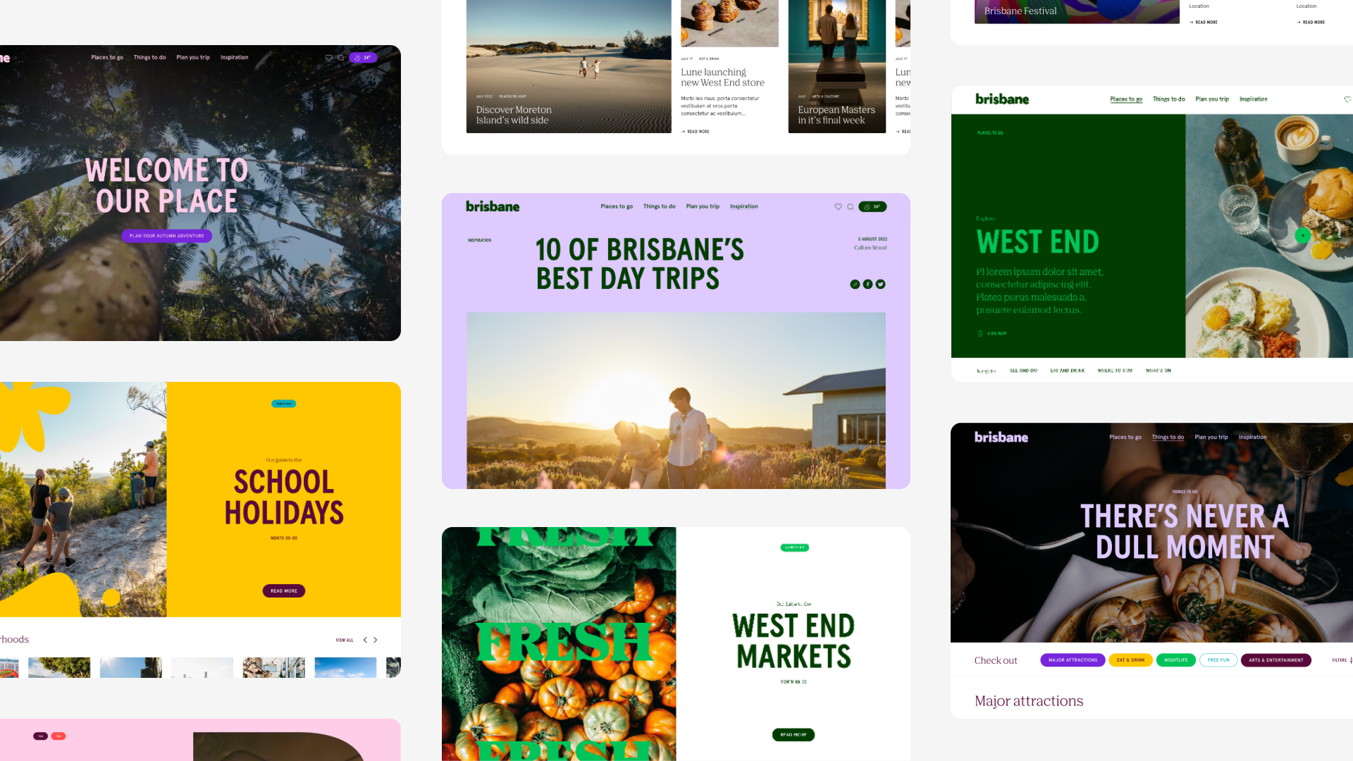
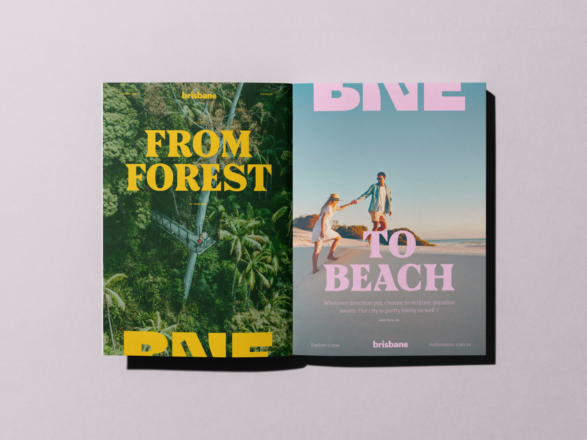
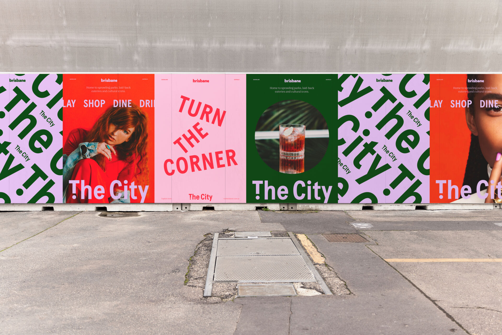
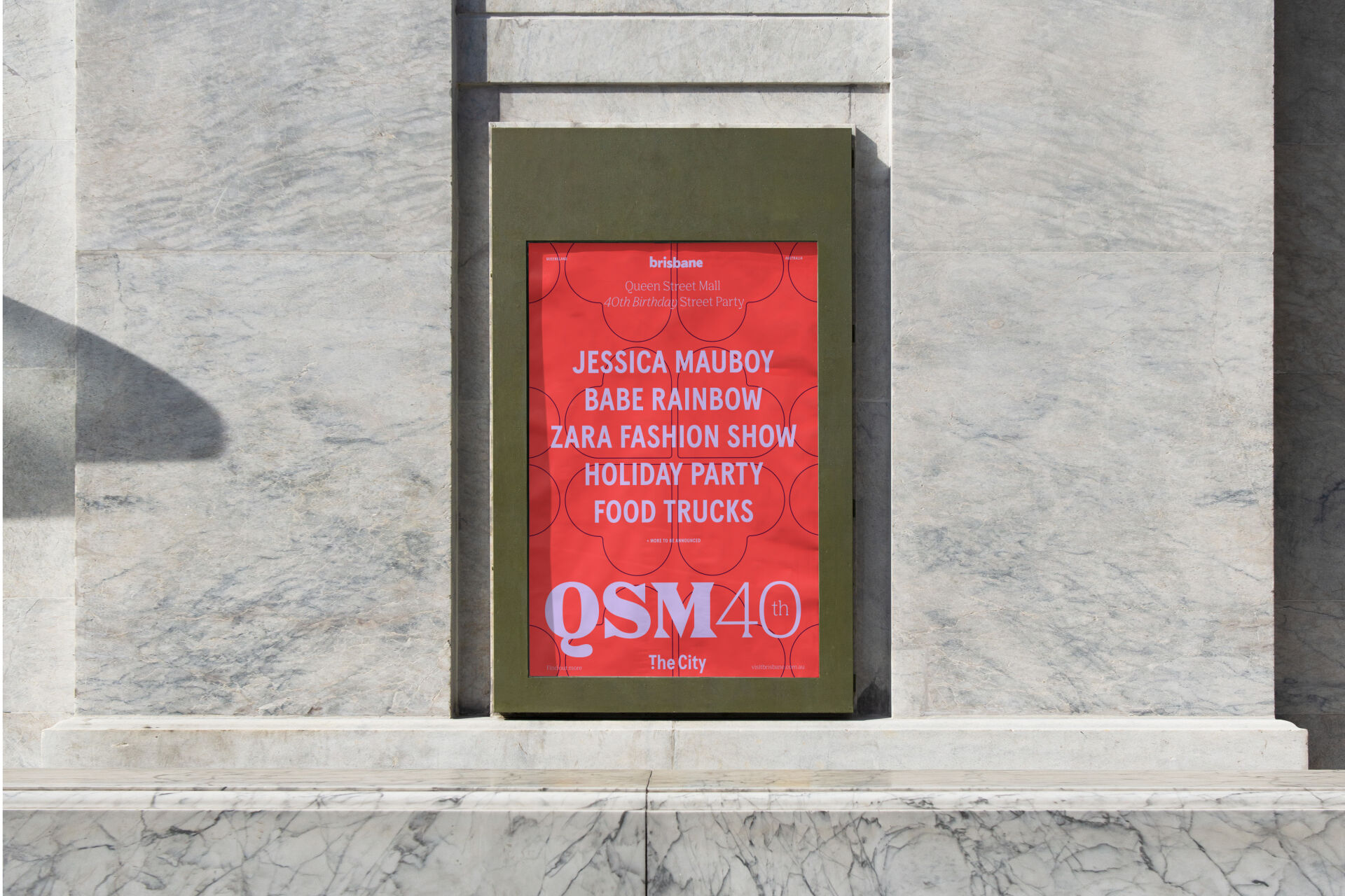
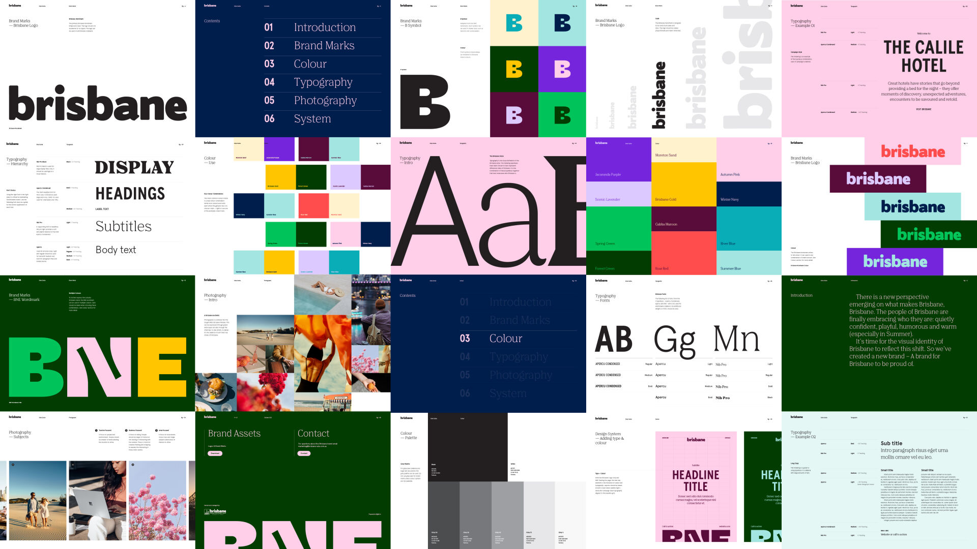
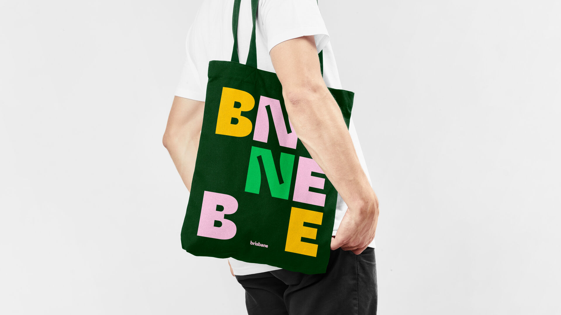
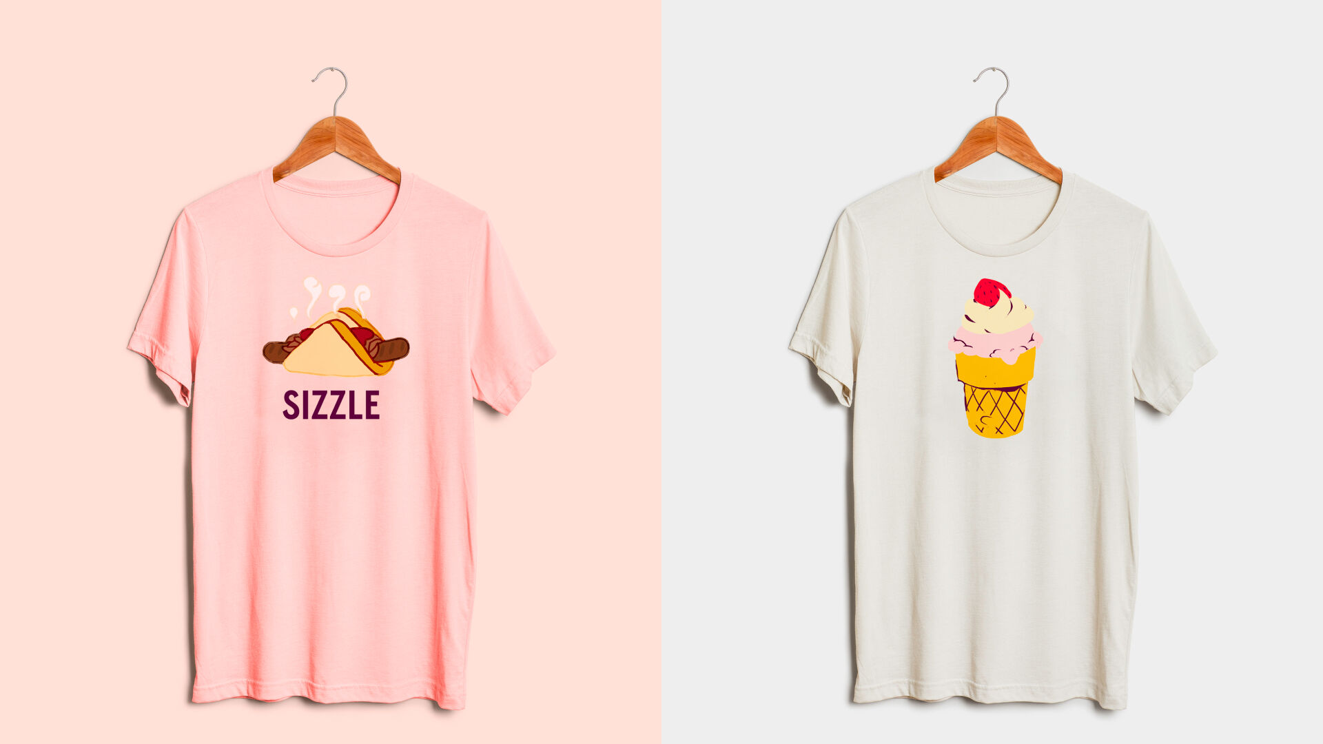
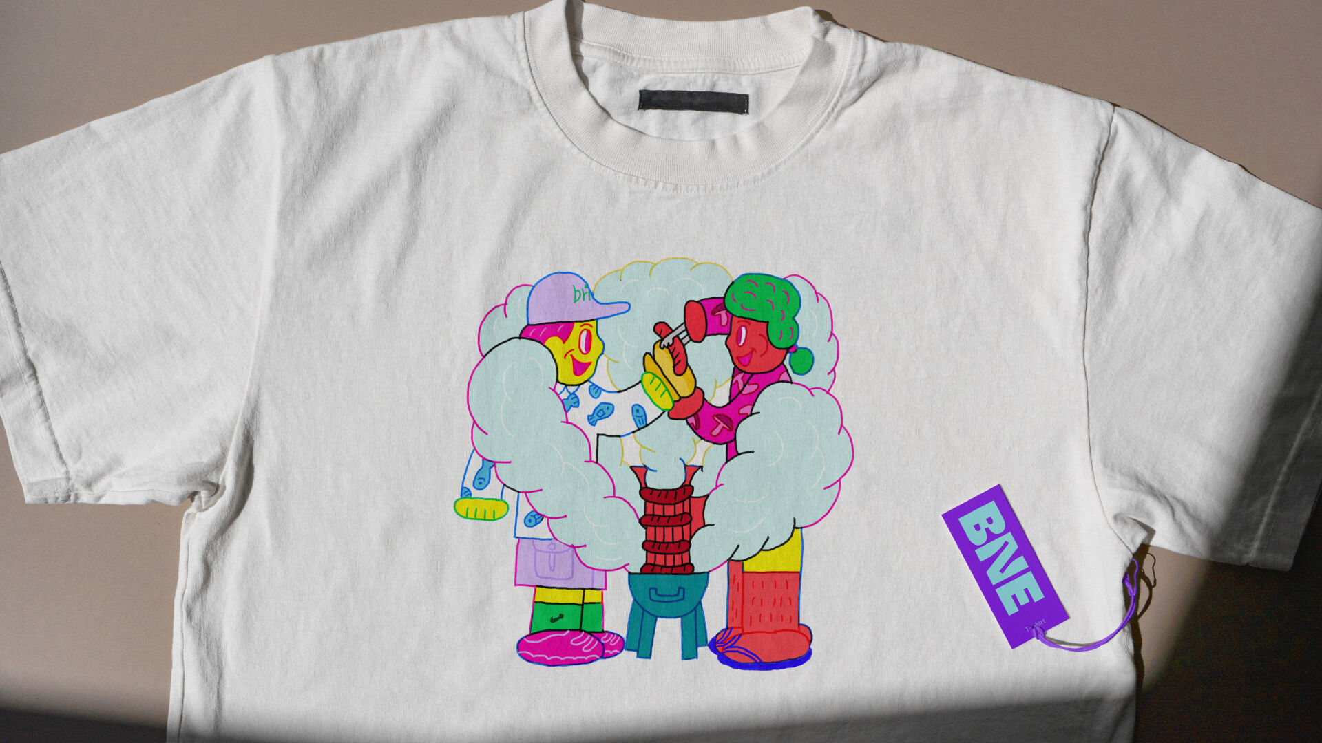
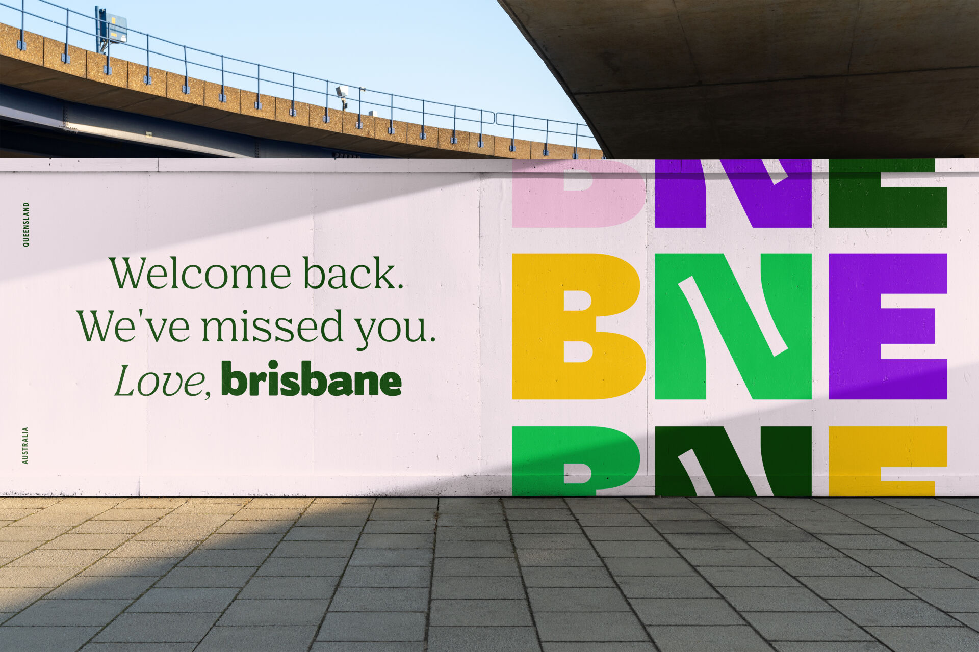
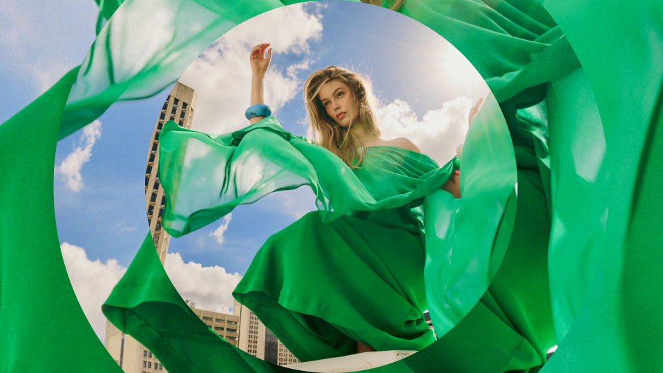
Developed with BEDA (Brisbane Economic Development Agency) we came to understand that Brisbane is not one landmark, but the sum of many things. Anchored around the existing brandmark we elevated it with a uniquely Brisbane colour palette celebrating everything from the blooming Jacarandas to the sands on Moreton Island. Typography added a voice both nostalgic and modern alternating between a 70's inspired serif (Nib by Colophon) to a bold, yet humanist sans serif (Apercu Condensed by Colophon). These two elements provided the foundation for more playful elements that really spoke to who Brisbane is. Illustrations, created by Niqui Toldi and Sem Han celebrated the smaller icons of Brisbane — Strawberry Ice creams, Sausage sizzles, cycling along the river all with quirk and friendly charm. The overall result is like a warm hug welcoming all to this amazing city.
Services
- Brand Strategy
- Graphic Design
- Motion Graphics
- Campaign
- Art Direction
Design System
The brand is built around a design system that enables Brisbane to create content at speed while maintaining brand consistency.


